Digital Printing Resolution Requirements for Sharp, Professional Logo Results
Learn the exact digital printing resolution requirements to ensure your logos look sharp and professional on branded merchandise across Australia.

Written by
Sienna Chandra
Branding & Customisation
Getting your logo onto branded merchandise sounds straightforward — until your beautifully designed artwork arrives on a batch of t-shirts looking blurry, pixelated, or washed out. For Australian businesses investing in promotional products, poor print quality isn’t just a wasted budget; it’s a direct reflection on your brand. Understanding digital printing resolution requirements for sharp logos is one of the most overlooked aspects of the branded merchandise process, and it’s something that can make or break an entire promotional campaign. Whether you’re a Sydney-based corporate team preparing for a conference, a Melbourne retailer ordering branded tote bags, or a Brisbane event organiser customising merchandise for a trade show, getting your artwork specs right from the start will save you time, money, and a lot of frustration.
Why Resolution Matters More Than You Might Think
Resolution refers to the amount of detail captured in an image, typically measured in DPI — dots per inch. The higher the DPI, the more detail the image contains, and the sharper it will appear when printed. For digital printing on promotional products, this is a critical consideration that many people overlook when sourcing branded merchandise.
Here’s a simple way to think about it: a logo that looks crisp on your computer screen may be saved at 72 DPI — which is standard for web display but completely insufficient for print. When that same file is used for decorating a t-shirt or a branded water bottle, the printer has to stretch the image to fit the required dimensions, and at 72 DPI the result is a pixelated mess that no amount of post-processing can fix.
The good news is that once you understand the basics, meeting digital printing resolution requirements for sharp logos becomes a straightforward part of your standard artwork preparation workflow.
The Golden Rule: 300 DPI at Print Size
The industry standard for high-quality digital printing is 300 DPI at the actual size the artwork will be printed. This is the figure you’ll hear from decorators across Australia, from Perth to Hobart, and it applies to most common merchandise decoration methods including direct-to-garment (DTG) printing, dye sublimation, and digital transfer printing.
This “at print size” qualifier is important. If your logo needs to be printed at 10cm × 5cm, your artwork file must be 300 DPI at exactly those dimensions. Scaling a 300 DPI image to a larger size in Photoshop doesn’t add real pixel data — it just spreads existing pixels further apart, reducing the effective resolution. A good rule of thumb is to create or request artwork at a slightly larger size than you need, at 300 DPI, to give yourself flexibility.
Vector vs. Raster: Understanding the Difference
This is arguably the single most important concept to understand when it comes to logo reproduction quality.
Raster files (such as JPG, PNG, and BMP) are made up of pixels. They have a fixed resolution, and when scaled beyond their native size, they lose quality. A raster logo at 300 DPI looks excellent at its intended size but becomes blurry when enlarged.
Vector files (such as AI, EPS, SVG, and PDF) are built using mathematical paths rather than pixels. They can be scaled to any size — from a business card to a billboard — without any loss of quality. For branded merchandise production, vector files are the gold standard.
If your brand’s logo was professionally designed, you should have access to vector files. If you’re unsure, ask your graphic designer or check with your art department. For organisations ordering products like custom branded t-shirts or merchandise for school sporting events through platforms covering school sport Australia merchandise, providing a vector logo file from the outset will dramatically improve your final result.
Colour Mode: RGB vs. CMYK and Why It Matters
Alongside resolution, colour mode is a frequently misunderstood component of print-ready artwork. Digital screens display colours using the RGB (Red, Green, Blue) model, which can produce a far wider range of bright, vivid colours than the CMYK (Cyan, Magenta, Yellow, Black) model used by most commercial printers.
When an RGB file is converted to CMYK for printing, colours can shift significantly. Bright blues, vibrant greens, and neon tones are particularly prone to looking dull or muted in their CMYK equivalents. For best results:
- Submit artwork in CMYK format when working with digital or offset printers
- Request PMS colour matching for brand-critical colours where exact consistency matters across all materials
- Request a physical proof before approving large orders, especially for items like branded stainless steel water bottles or high-volume custom stubby holders where colour accuracy is essential to brand identity
Transparency and Background Handling
Another common artwork issue is transparent backgrounds. If your logo sits on a transparent PNG background and is placed onto a coloured product or substrate, the result will depend entirely on how that transparency is handled by the printer’s RIP (Raster Image Processor) software. Always confirm with your supplier whether they need a transparent background, a white background, or a background matched to the product colour.
Recommended File Formats by Decoration Method
Different decoration methods have different format preferences. Here’s a quick reference guide:
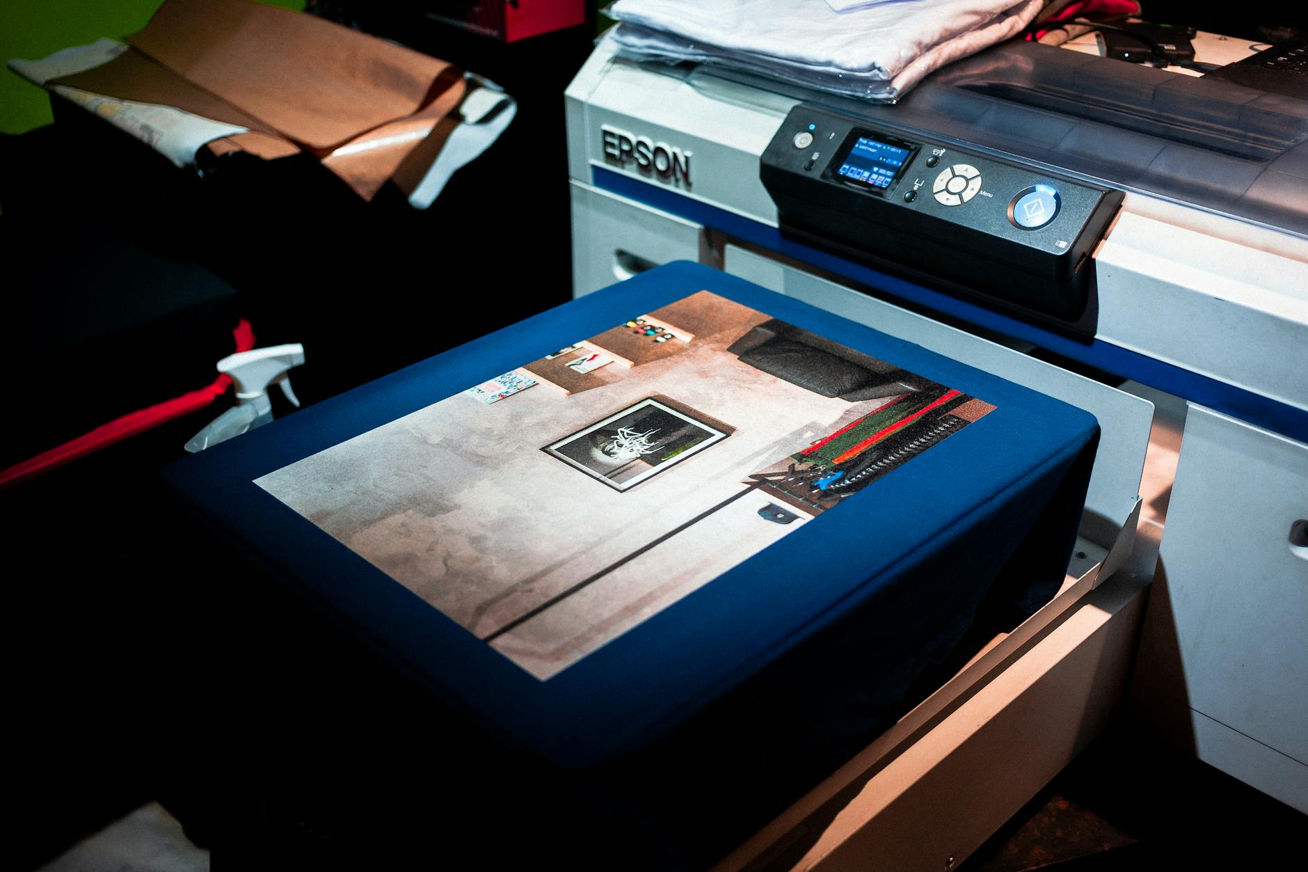
Direct-to-Garment (DTG) Printing
DTG is increasingly popular for custom apparel and merchandise. It allows for full-colour, photographic-quality prints directly onto fabric. For DTG, a PNG file at 300 DPI with a transparent background is typically the preferred format. This method is particularly suitable for complex, multi-colour logos or artwork with gradients.
Dye Sublimation
Sublimation printing involves transferring dye onto polyester or polymer-coated surfaces using heat and pressure. The result is a vibrant, permanent print that is part of the substrate rather than sitting on top of it. For sublimation, 300 DPI CMYK PDF or TIF files are commonly requested. This method is widely used for items like promotional yoga mats (relevant for wellness campaigns, including promotional yoga mats for pharmaceutical companies) and full-coverage apparel.
UV Digital Printing
UV printing uses ultraviolet light to instantly cure inks onto hard surfaces such as phone cases, USB drives, and drinkware. If your organisation is ordering promotional USB pen drives or similar tech accessories, UV printing is a common decoration method and requires high-resolution vector or 300 DPI raster files.
Digital Transfer Printing
Commonly used for garments, transfers are printed separately and then heat-applied to the product. Vector artwork is ideal here, but high-resolution rasters at 300 DPI are also accepted by most suppliers.
Common Artwork Mistakes That Ruin Print Quality
Even experienced marketing managers make these errors. Knowing what to avoid will help you deliver a smoother project every time.
Low-resolution logos pulled from websites. This is the most frequent culprit. Website logos are optimised for fast loading and are typically 72 DPI. Never use a screenshot or a logo downloaded from a website for print purposes.
Scaled-up small files. Increasing the dimensions of a small PNG in Photoshop doesn’t improve its resolution. It just makes a bigger blurry image.
Incorrect colour profiles. Submitting RGB artwork for CMYK printing without checking the conversion can lead to significant colour shifts, particularly for brand colours.
Missing fonts. If your logo includes text that isn’t outlined (converted to paths), the printer’s software may substitute a different font, distorting your design entirely. Always outline your fonts before submitting files.
Over-relying on proofs without checking at scale. A digital proof on screen may look sharp because screens compensate for low resolution. Always review physical samples for high-volume or premium orders.
These issues are particularly relevant when ordering merchandise across diverse product categories — whether you’re looking at eco-friendly promotional items, outdoor event merchandise, or branded products for trade show displays.
Working With Your Merchandise Supplier on Artwork
A professional merchandise supplier will have a dedicated artwork or pre-press team who can review your files before production begins. This is one of the most valuable services available to you as a buyer. Don’t hesitate to ask for a digital proof — or better yet, a physical pre-production sample — before signing off on a full run.
For organisations placing significant orders, particularly government departments, councils, and large corporates across cities like Adelaide, Darwin, and Canberra, the investment in a sample is almost always worth it. Understanding supplier consolidation trends and building a strong relationship with one or two trusted suppliers also helps, as your artwork and preferences are stored on file and consistently applied across orders.
If your team is based in regional areas or smaller markets, suppliers that service areas like Wollongong and surrounding regions or Melbourne’s childcare and education sector (see promotional products for childcare businesses in Melbourne) can often provide local artwork support as part of their service.
Planning Ahead: Building an Artwork-Ready Brand Kit
One of the most practical things any Australian business can do is build and maintain a centralised brand kit that includes:
- Vector logo files (AI, EPS, SVG) in all approved variations (full colour, reversed, one-colour, mono)
- High-resolution PNG files at 300 DPI for digital print applications
- CMYK and PMS colour codes for all brand colours
- Font files or confirmed font names with licensing information
- Clear brand usage guidelines specifying minimum logo sizes and exclusion zones
Having this kit ready means your merchandise orders can be processed faster, proofs can be approved more confidently, and your brand will be reproduced consistently across every product — from hi-vis workwear (see our guide to promotional hi-vis vests) to custom stubby holders and everything in between. As we move further into 2026, brands that invest in artwork quality are seeing better consistency across an increasingly diverse product mix, a trend reflected in the latest promotional products market data for 2026.
Conclusion: Key Takeaways for Sharp Digital Printing Results
Getting your artwork right before placing a merchandise order is one of the highest-leverage things you can do to protect your brand’s visual integrity. Understanding digital printing resolution requirements for sharp logos isn’t just a technical exercise — it’s a core part of professional brand management.
Here are the essential points to take away:
- Always use 300 DPI artwork at the actual print size — never upscale low-resolution files and expect sharp results
- Vector files (AI, EPS, SVG) are the gold standard for logo reproduction and should be used wherever possible
- Submit artwork in CMYK for print jobs and request PMS matching for brand-critical colours
- Outline all fonts and check that backgrounds are handled correctly for your specific product and decoration method
- Request proofs before approving large runs, especially for premium or high-visibility merchandise, and build a comprehensive brand kit to streamline future orders
Investing the time upfront to get your artwork specifications right pays dividends every time you order branded merchandise — because a sharp, vibrant logo doesn’t just look good, it builds confidence in your brand with every person who sees it.